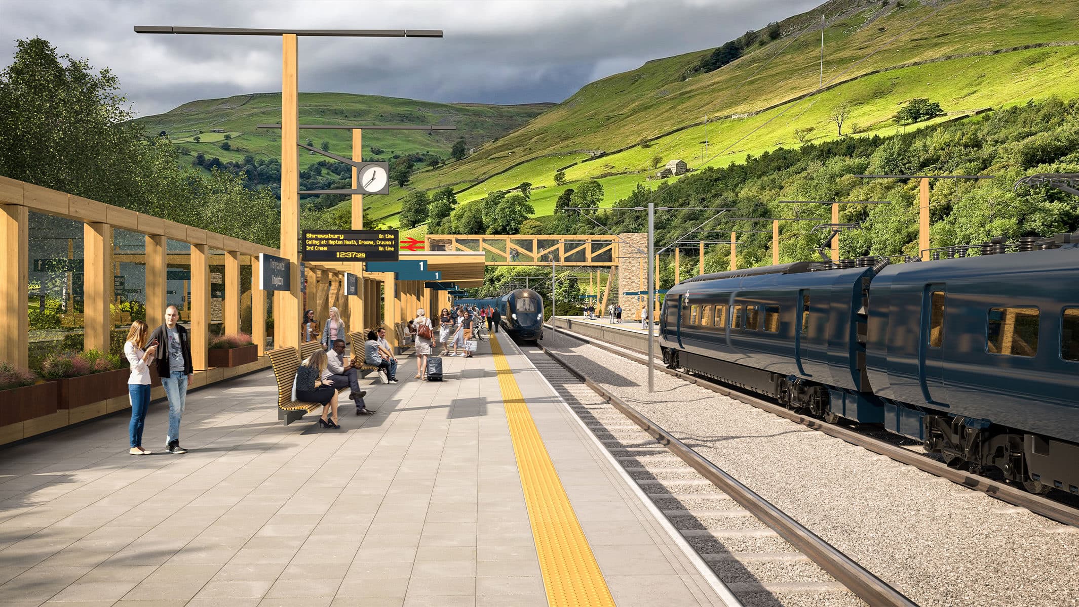
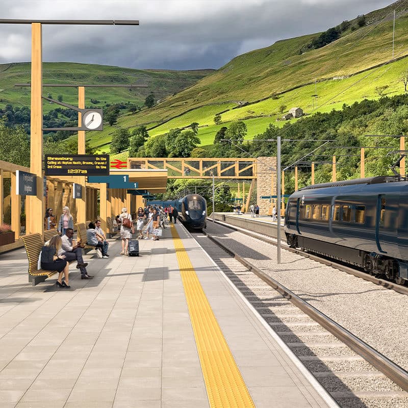
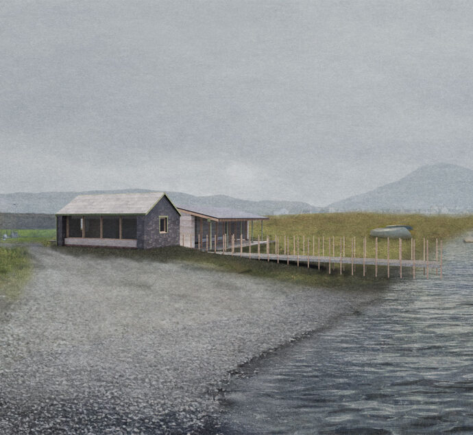
We recently entered a competition to redesign Network Rail Stations led by the RIBA. Our proposal is for a simple, modular, robust, and sustainable design language for small to medium sized railway stations across the UK. It is adaptable to and sympathetic with a wide range of urban and landscape contexts, and with existing buildings.
The proposed language also extends Britain’s rail design heritage. In the early 1960s, Jock Kinneir and Margaret Calvert developed a new typeface for Britain’s railways: Rail Alphabet. In the same period, the consultancy Design Research Unit developed a new graphic identity and introduced the robust and durable ‘double arrow’ logo, still in use at stations. 3DReid’s proposal provides the three-dimensional counterpart to the Kinneir and Calvert typeface and to the graphic identity that featured it: we’ve called it a Station Alphabet.
Station Alphabet is essentially modular—a ‘kit of parts’—and uses timber (a low embodied carbon material) as its primary structural material. Where modules connect to form longer spans, engineered timber is used. A range of shelter types is possible, from full enclosure to canopies and wind break walls. The module can be in-filled to become solid using a material with local significance (for example: flint or brick). The module can also be in-filled with a three-dimensional version of the ‘double arrow’ logo.
Station Alphabet uses a three metre module. A wide range of spatial arrangements is possible, ranging from open spaces such as arrival courtyards to fully enclosed support spaces (passenger WCs, railway staff welfare).
Some existing stations on the UK network successfully incorporate complementary uses. For example, Wareham in Dorset has a bicycle shop, and Corrour station house in the Highland region is a popular inn for ramblers.
Station Alphabet lends itself to layouts that facilitate complementary uses: for example, a bicycle cafe and repair shop. The module easily extends to enclose adjacent outdoor spaces and promotes natural surveillance.
The arrival spaces of stations can be more than car parks or taxi drop offs. A courtyard arrangement blurs the distinction between indoors and outdoors, is more welcoming, and helps to integrate complementary uses.


